The Made With Intent blog
Visual Editor has just shipped. It's a brand new feature for Made With Intent.
Yes, we know this isn't something groundbreaking, and you've used something like Visual Editor before, with your favourite tools, but this is one of the most requested features from our customers.
It lets you create and preview on-site changes against your own live website. You'll have more flexibility and control over the kinds of experiences you'd like our tool to test and deliver to your customers.
It'll reduce the need for developers to get involved, and give you a familiar, visual way of editing experiences, directly within Made With Intent, that you can ship on your own.
So, that's the short version. Here's a bit more background on what it does, why we built it and a sneak preview of what's coming next.
What Visual Editor does
Visual Editor lets you create and preview on-site changes against your own live website, without developer support and without guessing how something will look once it's live.
It solves a familiar problem. The person responsible for the site experience is rarely the person who can build it. As Ryan Jordan, our CPO, puts it:
"The people that are using our product are generally those who are responsible for the site experience but not necessarily technically able to always build for the site experience."
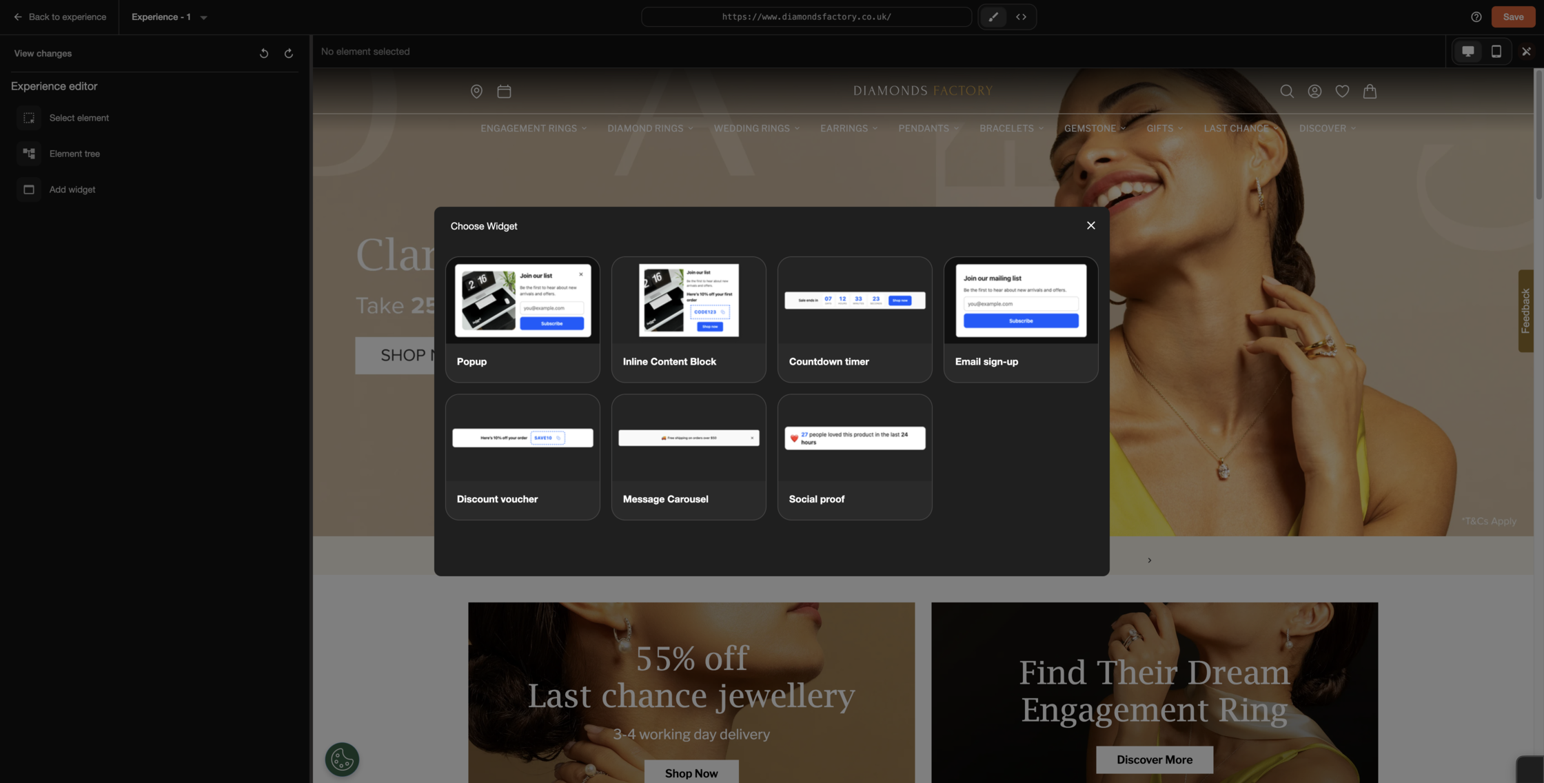
Here's a list of of some of things you'll be able to do with this new feature:
- Change a banner
- Update, restyle, hide or show a specific element on a page
- Fully customisable overlays, built to cater for every moment
- Build and preview components on your live site before they go anywhere near a visitor.
You'll have, no doubt, used lots and lots of WYSIWYG tools before in your favourite A/B testing, experience and ecommerce tools. We've deliberately designed Visual Editor to be familiar, and work similar to the products you know and love, so you'll find it intuitive to use.
We built Visual Editor because it is the feature that was most requested by our customers. We feel it's a natural evolution of our well-loved template library. With the ability to essentially edit your site by clicking and typing, we think it'll be flexible enough for non-technical people to pick it up and build something quick and dirty.
But this new feature will also let you see the context of what you've built in-situ, perfect for your site and your context, instead of leaving it to imagination.
But Ryan reckons you'll go further: "Previously, campaigns delivered with Made With Intent were generally thought about from a \"template\" first approach, but the Visual Editor now allows you to think about how real-time moments of intent can change the page and its content"
Moving towards a goal-orientated mindset
We reckon our Visual Editor will help you change your mindset. Most experience delivery tools tell you to pick a format first. You decide you want a pop-up, then you go and fill it with content. You decide you want a sticky banner, then you fill that with content. The format leads, and the goal follows.
But that's backwards for a lot of what teams are trying to do.
Let's take basket abandonment. One brand might come in knowing they want a pop-up. Fine, build the pop-up, fill it with content. But another brand comes in knowing only that they want to offer a 20% discount when someone's about to leave. They've got the goal. Why should we dictate how you deliver that discount?
So we've built Visual Editor to work from either end. Start with a format and add your content. Or start with your content: the discount, the message, the countdown timer. Then see how it looks as a sticky banner, a pop-up, a slide-in, or an in-page element.
"Most of the market always just goes format-into-content," Ryan explained. "What we're doing by flipping it and being able to go content-into-format is giving people the ability to play around."
On paper this might seem like a small thing. But we think this will give you different options to explore different solutions to the same problems you've been optimising and experimenting with for years. You'll be inspired to create different solutions to the same problems you've been having for years.
A quick note on CSP
Some sites run Content Security Policy (CSP) rules that can stop a visual editor from working on the page. To help with that, we're rolling out a Chrome extension called Intent Studio that unblocks it.
If your site's CSP rules mean you can't use the editor on the page yet, nothing else changes, everything you could do yesterday, you can still do today. For sites that don't have CSP rules, you should be fine without Intent Studio.
So, what's coming next?
We'll be adding more templates. We've built Visual Editor to be flexible deliberately, so people get used to it and start asking "can it do this, can it do that," we'll keep adding to what's there.
Longer term, this is where things get a bit interesting. We're finding with tools like Claude Design, many, many people are designing experiences using prompts, instead of fiddling around manually.
Ryan says: "It's now no longer click on an element and change the background colour to blue. It's tell an AI, make this background blue, and it kind of just does it for you."
The widgets behind Visual Editor have been built so that AI can understand them and make changes to them. This is the groundwork for letting you describe the change you want and have it built for you.
There's no hard date on when this is coming, but Ryan said it's a matter of weeks, not quarters.
Made With Intent has always been about one thing: enabling you to respond to real-time intent on your ecommerce site. Everything we do is in service of making that easier and more effective.
For a long time, acting on intent meant working within the formats we gave you or dev resource. Visual Editor changes that. It lowers the barrier between knowing what you want a visitor to experience and actually building it — without waiting on someone else to do it for you.
The gap between who owns the site experience and who can build it just got a lot smaller.
And the next step, simply describing the change instead of building it manually, is next.
Login to Made With Intent to see Visual Editor in action. If you're not a customer yet, and are curious, why don't you book a demo?


Latest articles

Why standard advice on eCommerce bounce rate might not be enough
In 2023, Google Analytics 4 replaced Universal Analytics (UA) as the default, shifting the definition of bounce rate entirely. Under UA, any single-page session counted as a bounce, regardless of how long the visitor stayed or what they did. Under GA4, a "bounce" is a session with no meaningful engagement in the first ten seconds (Google Analytics Help, 2023).
Most published advice on reducing eCommerce bounce rate, including almost everything ranking on the first page of Google right now, predates that change. The benchmarks cited, the comparisons drawn, the thresholds used to define a "good" or "bad" rate: much of it is calibrated to a metric that no longer exists in its original form. It's worth bearing in mind before treating a published figure as a reliable signal that something is broken.
There's a connection here to the intent signals argument. GA4 defines a bounce as a session with no meaningful engagement, which is itself the absence of any intent signal. However, the metric has quietly moved closer to what we're suggesting: that what matters is whether a visitor showed signs of engagement and intent, not simply whether they viewed more than one page.
The standard fixes aren't useless. A page that takes four seconds to load on mobile will lose shoppers. Navigation that buries products three levels deep creates friction. These are real problems. But they're also largely table stakes. Most mid-market eCommerce teams have addressed them, or at least know they need to.
What the generic checklist rarely asks is: why did this particular visitor leave this particular page? Speed explains some of it. Confusing navigation explains more. But there's a third explanation that gets far less attention: the visitor arrived with a specific intent, and the experience they landed on didn't reflect it.
What on-site intent signals actually are
Intent signals aren't abstract. They're specific, observable events already firing on your site every day, most of them visible in your analytics if you know where to look.
Consider what happens in the first thirty seconds of a session. A visitor lands on a product detail page. Do they scroll past the first image, or stop there? Do they interact with the size selector, or skip straight past it? Do they hover over the "Add to Basket" button without clicking? Do they navigate to a second product, return to the category page, or leave entirely?
Each of those micro-behaviours carries a signal. Taken individually, they don't mean anything. Taken together, they start to suggest something about intent: whether the visitor is browsing loosely, comparing seriously, or hitting a wall they can't get past.
Some of the most informative on-site signals include:
- Scroll depth: how far down the page a visitor gets before stopping or leaving
- Hover behaviour: where the cursor lingers without a click (interest that didn't convert to action)
- On-site search queries: what visitors type into the search bar, and crucially, what they do next
- Dwell time relative to site average: a visitor spending significantly longer on a PDP than average may be closer to buying than the raw bounce metric suggests
- Variant and size selection: engaging with product options is a meaningful buying signal, regardless of whether a purchase follows
- Back-navigation patterns: returning from a PDP to the same category page repeatedly often indicates comparison behaviour, not disinterest
None of these signals individually tells you what a visitor intends to do. But patterns across them might tell you something useful about why they're not finding what they came for, and whether the bounce that follows is a genuine commercial loss or an inevitable one.
For a deeper look at why behavioural signals tend to outperform the proxy metrics most teams rely on, Predictions Not Proxies, our blog post, is worth a read.
The signals worth watching by page type
One limitation of tracking bounce rate as a single site-wide number is that it flattens very different problems into one metric. A visitor who bounces from the homepage is probably experiencing something quite different from one who bounces from a product detail page after two minutes of engagement. The signals worth reading, and the interventions that might help, differ depending on where the bounce is happening.
Homepage
Homepage bounces are often about relevance at first impression. Was the visitor expecting something the page doesn't immediately surface? Traffic source matters here. A visitor arriving from a paid social ad promoting a specific sale and landing on a generic homepage is likely to read that as a mismatch before they've even scrolled.
You should, instead, consider time to first scroll, engagement with any navigation element, and click-through to any product page. A visitor who lands and never scrolls is usually gone for reasons that faster load times can't fully address.
Category pages
Bounce from a category page often points to a discovery problem. Either the product range isn't what the visitor expected, or the tools for narrowing it down (filters, sorting, on-site search) aren't doing their job.
You could monitor for filter use, scroll depth through the product grid, and whether visitors click through to multiple PDPs or just one (or none). A visitor who opens the filter panel but doesn't apply anything may be signalling that the available options don't map to what they had in mind.
Product detail pages
PDP bounce is the most commercially sensitive, because this is where visitors are closest to a decision and where intent signals tend to be richest. Image engagement, variant selection, and dwell time relative to site average can all suggest whether a visitor is actively evaluating or has already decided the product isn't right.
A visitor who spends three minutes on a PDP, selects a size, and then leaves is a very different prospect from one who bounced in under ten seconds. Treating both as equivalent in a site-wide bounce metric misses that distinction entirely, and probably points the subsequent analysis in the wrong direction.
Paid landing pages
For pages receiving meaningful paid traffic, the most important signal is often the simplest: does the message on the page match the ad that brought the visitor here? Post-click relevance is frequently the first place to look when bounce rate on paid traffic is elevated, before speed or UX enter the conversation.
Consider a fashion retailer seeing high PDP bounce from paid social. You may think audience mismatch or slow load times. But scroll depth data tells a different story. Visitors are reaching the size selector and stopping, not scrolling away. The real problem is out-of-stock variants being featured in the ad creative. Shoppers arrive, find their size unavailable, and leave. This is nothing to do with a UX fix, simply a case of reading the right signal, the right context.
Acting on intent signals before the bounce happens
Reading these signals is useful. Responding to them is where it gets more interesting.
The standard eCommerce pop-up is a useful counterexample. A blanket overlay triggered by exit intent, offering a discount to everyone regardless of what they've been doing, ignores every signal the visitor has sent. A visitor who spent four minutes on a PDP, selected a variant, and then paused receives the same intervention as one who arrived and left in eight seconds. So, really, you're not delivering a proper personalised experience that's appropriate to your customers' different needs.
A more considered approach starts with the signal, instead of the user navigating away. A visitor showing strong PDP engagement (extended dwell time, variant selection, multiple image views) is telling you something. The right response is probably social proof surfaced at that moment: stock scarcity, recent purchase activity, a well-timed review. Not a discount. A visitor who used the search bar, found no useful results, and is now leaving needs a different intervention entirely: a related product suggestion, or a prompt to browse a relevant category.
The interventions don't have to be complex to be more relevant. Start with your highest-bounce page type, identify which signals are already firing there, and ask whether your current exit triggers reflect any of them. That's a reasonable first step, and it costs nothing to consider.
If you're looking at how this kind of approach works for browse abandonment specifically, our browse abandonment use case walks through one way to think about it.
What a bounce means for your CRM, and why it matters
Bounce rate is typically discussed as a traffic or UX problem. It's less often discussed as a CRM problem. But there's an argument that it should be.
Every visitor who leaves without converting, subscribing, or taking any traceable action represents not just a lost session, but a lost contact. For a brand spending meaningfully on paid acquisition, that loss isn't only the missed immediate sale. It's the absence of any first-party data to re-engage with later. The CAC clock is ticking whether or not the visit converts.
The intent signals that might help reduce bounce in the moment are the same signals that could inform a more relevant recovery sequence when the bounce does happen. A visitor who engaged with a specific category, hovered on a product, and then left is a different re-engagement prospect from one who arrived on the homepage and bounced immediately. Where that behavioural data is captured, it can feed a browse abandonment email or SMS that speaks to what the visitor was actually looking at, not a generic "you left something behind" message.
Most browse abandonment recovery today operates on a relatively simple trigger. The visitor viewed a product and left. Intent signals could make that logic more nuanced, and the message that follows more relevant to where the visitor actually was in their decision.
How to read bounce rate differently
Bounce rate, as a metric, doesn't tell you very much on its own. It tells you someone left. It doesn't tell you why, which page type to prioritise, or whether the bounce represents a genuine commercial loss or a session that was never going to convert.
On-site intent signals can't answer all of those questions. But they might answer more of them than page speed tests and navigation audits typically do. For eCommerce teams who've already done the basics and are still looking for what to try next, it's worth examining what visitors are doing before they leave, not just that they left.
That shift in framing, from "how do we stop bounces?" to "what are bounces telling us?", might be where the more useful work sits.
If you want to see how Made With Intent reads on-site intent signals across eCommerce traffic, book a demo and we'll walk through it with your site.
Visual Editor has just shipped. It's a brand new feature for Made With Intent.
Yes, we know this isn't something groundbreaking, and you've used something like Visual Editor before, with your favourite tools, but this is one of the most requested features from our customers.
It lets you create and preview on-site changes against your own live website. You'll have more flexibility and control over the kinds of experiences you'd like our tool to test and deliver to your customers.
It'll reduce the need for developers to get involved, and give you a familiar, visual way of editing experiences, directly within Made With Intent, that you can ship on your own.
So, that's the short version. Here's a bit more background on what it does, why we built it and a sneak preview of what's coming next.
What Visual Editor does
Visual Editor lets you create and preview on-site changes against your own live website, without developer support and without guessing how something will look once it's live.
It solves a familiar problem. The person responsible for the site experience is rarely the person who can build it. As Ryan Jordan, our CPO, puts it:
"The people that are using our product are generally those who are responsible for the site experience but not necessarily technically able to always build for the site experience."
Here's a list of of some of things you'll be able to do with this new feature:
- Change a banner
- Update, restyle, hide or show a specific element on a page
- Fully customisable overlays, built to cater for every moment
- Build and preview components on your live site before they go anywhere near a visitor.
You'll have, no doubt, used lots and lots of WYSIWYG tools before in your favourite A/B testing, experience and ecommerce tools. We've deliberately designed Visual Editor to be familiar, and work similar to the products you know and love, so you'll find it intuitive to use.
We built Visual Editor because it is the feature that was most requested by our customers. We feel it's a natural evolution of our well-loved template library. With the ability to essentially edit your site by clicking and typing, we think it'll be flexible enough for non-technical people to pick it up and build something quick and dirty.
But this new feature will also let you see the context of what you've built in-situ, perfect for your site and your context, instead of leaving it to imagination.
But Ryan reckons you'll go further: "Previously, campaigns delivered with Made With Intent were generally thought about from a \"template\" first approach, but the Visual Editor now allows you to think about how real-time moments of intent can change the page and its content"
Moving towards a goal-orientated mindset
We reckon our Visual Editor will help you change your mindset. Most experience delivery tools tell you to pick a format first. You decide you want a pop-up, then you go and fill it with content. You decide you want a sticky banner, then you fill that with content. The format leads, and the goal follows.
But that's backwards for a lot of what teams are trying to do.
Let's take basket abandonment. One brand might come in knowing they want a pop-up. Fine, build the pop-up, fill it with content. But another brand comes in knowing only that they want to offer a 20% discount when someone's about to leave. They've got the goal. Why should we dictate how you deliver that discount?
So we've built Visual Editor to work from either end. Start with a format and add your content. Or start with your content: the discount, the message, the countdown timer. Then see how it looks as a sticky banner, a pop-up, a slide-in, or an in-page element.
"Most of the market always just goes format-into-content," Ryan explained. "What we're doing by flipping it and being able to go content-into-format is giving people the ability to play around."
On paper this might seem like a small thing. But we think this will give you different options to explore different solutions to the same problems you've been optimising and experimenting with for years. You'll be inspired to create different solutions to the same problems you've been having for years.
A quick note on CSP
Some sites run Content Security Policy (CSP) rules that can stop a visual editor from working on the page. To help with that, we're rolling out a Chrome extension called Intent Studio that unblocks it.
If your site's CSP rules mean you can't use the editor on the page yet, nothing else changes, everything you could do yesterday, you can still do today. For sites that don't have CSP rules, you should be fine without Intent Studio.
So, what's coming next?
We'll be adding more templates. We've built Visual Editor to be flexible deliberately, so people get used to it and start asking "can it do this, can it do that," we'll keep adding to what's there.
Longer term, this is where things get a bit interesting. We're finding with tools like Claude Design, many, many people are designing experiences using prompts, instead of fiddling around manually.
Ryan says: "It's now no longer click on an element and change the background colour to blue. It's tell an AI, make this background blue, and it kind of just does it for you."
The widgets behind Visual Editor have been built so that AI can understand them and make changes to them. This is the groundwork for letting you describe the change you want and have it built for you.
There's no hard date on when this is coming, but Ryan said it's a matter of weeks, not quarters.
Made With Intent has always been about one thing: enabling you to respond to real-time intent on your ecommerce site. Everything we do is in service of making that easier and more effective.
For a long time, acting on intent meant working within the formats we gave you or dev resource. Visual Editor changes that. It lowers the barrier between knowing what you want a visitor to experience and actually building it — without waiting on someone else to do it for you.
The gap between who owns the site experience and who can build it just got a lot smaller.
And the next step, simply describing the change instead of building it manually, is next.
Login to Made With Intent to see Visual Editor in action. If you're not a customer yet, and are curious, why don't you book a demo?
.jpg)
MandM, a British online fashion retailer, captured 88% more email signups from their popups. They didn't rewrite the copy. They didn't redesign their site. They just changed when their message appeared.
How did they manage this? Simply, they made the switch from rule-based experience delivery, to an intent-based approach.
And the results across email capture and product recommendations tell a consistent story: rule-based experience delivery forces a single answer on a question that has many right answers.
Rigid, predefined rules can't answer those questions. Intent signals can. Improving the impact of your onsite experiences is all about sending the right message, at the right time to your customers. We'll show you how Ollie Wilson, Insights Activation Manager at MandM does this with Made With Intent.
Editor's note: This blog post is a write up based on our first Intent Live: How MandM maximise revenue per user with personalised experiences. The session was hosted by Ollie Wilson, Insights Activation Manager at MandM. He showed how Made With Intent helped deliver better, more appropriate experiences to his customers, getting 88% more email signups.
The problem with rules-based personalisation
Most eCommerce personalisation sits on top of a set of rules. A customer views a Product Landing Page (PLP), then two Product Display Pages (PDPs), then gets hit with an email capture popup.
Or they get served "last viewed" recommendations based on browsing history. Or a basket abandonment email fires after 10 minutes of leaving the site.
These rules work to a point. Delivering the same experiences to every visitor using predefined rules, based on what they've done before gives you a critical foundation, but it puts a ceiling on growth.
They treat the journey as a sequence rather than a state. And a customer's state when they trigger your rules can be completely different depending on who they are, why they're there, and what they're about to do.
MandM saw this clearly in their email capture data. Their rule-based popup was capturing emails, but they were seeing broken journeys. The pop-up was technically firing at the right moment in the sequence. It wasn't firing at the right moment for the person and their intent.
As Ollie Wilson, Insights Activation Manager at MandM, puts it:
"It's not necessarily specific things a customer does in the journey. It's more so the timing and intent really helped us leverage this in a more efficient way."
The argument we're making here is that it's key to make this distinction. Rules track what a customer has done. The moment for you to intervene has gone. Intent-based experience delivery is issued in real time, predicts what they're about to do, and allows you to take appropriate action.
Pop ups delivered at the right time
The email capture popup is one of the highest-value tools in eCommerce, but also one of the most frequently misused. Use it too early and you interrupt a customer who hasn't found a reason to stay yet. Fire it according to a fixed rule and you'll hit some customers at the peak of their interest, but most others at exactly the wrong moment.
Ollie and his team tested a different approach. Instead of triggering the popup after a visitor hit a fixed sequence of pages, they introduced intent signals to identify when a customer was building meaningful engagement.
When those signals crossed a threshold, the popup fired. Exactly at the moment the customer was most receptive.
When talking about this, Ollie said: "We were hitting them at the right time because we knew they were building intent. They were right at the peak of their journey. Whereas before we were very much relying on this rule-based system which potentially wasn't the right time."
The results across three metrics tell the story. And these figures are lifted directly from the numbers Ollie shared during Intent Live:
- 55% increase in email sign-up rate, the rate at which people served the popup chose to subscribe
- 88% uplift in total emails captured, the volume consequence of that improved rate
- 15% resubscription rate among previously unsubscribed customers
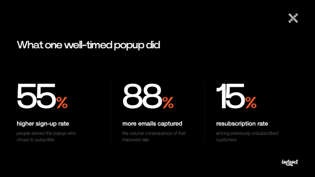
That last number is particularly significant. Lapsed customers don't re-subscribe because of a well-timed popup by accident. They re-subscribe because they were caught at a moment of genuine brand or product affinity, at the right time. This simply isn't possible with rules-based personalisation.
What MandM actually changed
What's actually surprising is how little MandM had to do to arrive at these results.
They were already using Bloomreach for their on-site experiences, including the consent popup. The popup itself, design, copy, offer, stayed exactly the same.
On changes, Ollie says: "To be honest, it was so easy. We already had our consent popup in Bloomreach as a web layer. It was just a trigger we had to change. With Made with Intent's integration being so easy, we could just feed all of the data into Bloomreach and then use that as the trigger for the popup rather than those stringent rule bases."
Agentic campaigns: testing 157 segment combinations at once
The email capture result came from MandM's first phase of work with intent signals. Their second phase went further, introducing a different kind of challenge.
MandM runs an active personalisation testing programme. At any given point, they're running recommendation strategy tests: last viewed versus category affinity versus the Bloomreach Loomi engine versus most popular, and so on.
Each test runs for roughly two weeks, produces results for a specific segment or device type, and then the cycle starts again.
The problem isn't that the testing doesn't work. It's that it's slow. Each test answers one question, for one segment, in one context. And by the time you've worked through a few cycles, the results of the first test may not apply to the next season, the next acquisition cohort, or mobile versus desktop. And not to mention how resource intensive this all is.
Agentic campaigns changed this by running multiple recommendation strategies in parallel, doing the segmentation work automatically.
MandM tested five homepage recommendation strategies simultaneously. Rather than splitting traffic across two variants and waiting two weeks per test, Made With Intent's optimisation agent tested all five, across 157 unique segment combinations, and allocated each visitor to the strategy most likely to drive Ollie's defined commercial goal; revenue per user.
The result was a 2% increase in revenue per user. But the more valuable output was just how granular MandM could get. Not just "strategy X wins." For MandM it was strategy X wins for loyal mobile customers, strategy Y wins for new desktop visitors, and for your most engaged customers, showing recommendations at all might be the wrong call.
Let that sink in: showing recommendations at all might be the wrong call.
On the PDP, where new customers arriving from paid search land and recommendations have some of the most direct commercial impact, MandM ran a similar test with five strategies including a "hidden" variant (no recommendations shown at all). The result: 4% increase in revenue per user, from 130 unique segment combinations tested.
On the webinar, Colin Spooner, Principal Value Consultant, at Made With Intent, describes what this looks like inside the platform:
"There's kind of no winners or losers anymore. It just is the best experience to give that visitor at the right time."
Sometimes, doing nothing is the best strategy
In MandM's PDP test, 14% of visitors were allocated to seeing no recommendations at all, and for that segment, it was the highest-performing option.
That segment, as Ollie describes it, is your most loyal customers. The ones who know the site, know what they want, and don't need or want a carousel of "You might also like" items interrupting their path to purchase.
Ollie says: "For a certain subset of customers, your very loyal customers, the ones that know the site, they know what they want, removing recommendations is actually beneficial. Sometimes it can be a bit of a loop for a customer."
The PDP recommendation loop is a real issue. A customer lands on a PDP, clicks a recommendation to another PDP, clicks another, and ends up in a browse abandonment spiral that started as a purchase intent session. It's almost like you're giving them too much to navigate through.
Removing the recommendations breaks the loop and lets the customer do what they came to do.
This can be uncomfortable for personalisation teams to hear whose KPI is coverage, ensuring every visitor gets served something. But it reflects a more mature way of thinking about personalisation: not "show more" but "show what's right, when it's right."
For some customers in some moments, the right thing is nothing.
What MandM's results point to
MandM's results across two distinct experiments expose the same fundamental flaw in how most onsite experiences are built. They're designed to give every customer an answer at predefined moments, when real impact is about giving each customer the right answer for their specific moment.
Rule-based email capture fires at step three of the journey regardless of whether the customer is engaged or about to leave. Sequential recommendation testing finds one winning strategy for one segment, then starts over.
Ollie used intent signals and agentic campaigns both push against that. One changes when you fire an experience based on real-time behavioural signals. The other changes what you show based on continuous, parallel testing across hundreds of segment combinations. The outcome, in both cases, is the same — fewer experiences wasted on the wrong customer in the wrong moment.
For MandM, the next step is applying agentic testing to placement-level messaging. So, buy now pay later, delivery propositions, app downloads, and letting our agent match messages to customer segments in real time across the same placements.
If you enjoyed this blog post, why don't you watch our Intent Live series over on YouTube? Failing that, we're going to be running these sessions frequently, so you can sign up here for our next session.
While we're doing CTAs, here's another one: If this has piqued your interest, why don't you book a demo with our team?
Promotional pricing is the practice of temporarily reducing prices to drive a specific commercial outcome. In eCommerce, it covers everything from percentage-off codes and flash sales to BOGO deals, loyalty tiers, and seasonal campaigns. Used right, it drives genuine revenue. Used badly, you'll trash your margin and train your best customers to wait for discounts.
What is promotional pricing?
Promotional pricing is a temporary reduction in the standard selling price, applied to drive a defined commercial goal. Typically these are: clearing inventory, acquiring new customers, reactivating lapsed buyers, or responding to a competitor's move. It is distinct from permanent price changes and from dynamic pricing, which adjusts in real time based on demand signals.
In eCommerce, the term covers a wider set of mechanics than in traditional retail. A promotional price can be a publicly visible markdown, a personalised discount code delivered by email, a segment-specific offer triggered on-site, a loyalty tier reward, or a bundle price. The delivery mechanism matters as much as the discount depth, because it determines who sees the offer and what behavioural context they bring to it.
Editor's note: This guide is written specifically for online retailers. B2B SaaS, subscription, and industrial pricing follow different mechanics and aren't covered here.
The seven types of promotional pricing (and when each actually works)
The taxonomy of promotional pricing is broadly consistent across the industry. What isn't consistent is an honest assessment of when each type actually delivers incremental revenue versus when it simply moves it.
Percentage discount
The most common format in eCommerce: 10%, 20%, 30% off a product or category. It's universally understood, easy to execute across email and on-site, and straightforward to calculate. The risk is anchoring. Once a customer has bought at 20% off, their willingness to pay the full price decreases. A portion of comparison shoppers will hold out, waiting for the same discount to return.
BOGO (buy one get one)
BOGO and its variants (buy two get one free, spend X get Y) increase average order value and can move inventory efficiently. The catch is unit margin. A buy-one-get-one-free on a product with a 40% gross margin isn't a 50% discount from a financial standpoint. It wipes out margin on the second unit entirely.
Flash sales
Short-duration, high-discount events — typically 24 to 48 hours — that create urgency and can generate significant revenue very quickly. They work well for clearance. The problem is audience conditioning. Customers who've seen three or four flash sales start to learn the pattern: wait, and then the price drops. Used too frequently, flash sales train a comparison-shopping segment rather than converting a high-intent one.
Loyalty pricing
Tiered discounts awarded through a loyalty or membership programme: early access, exclusive pricing, free shipping thresholds for members. This is the most margin-efficient form of promotional pricing because the discount is earned, not freely given. It also builds switching cost, which percentage discounts and flash sales don't. If you're choosing between loyalty pricing and blanket discounting as a long-term retention mechanic, loyalty pricing is almost always the better investment. Research drawing on Bain & Company data found that repeat customers spend 67% more than new buyers by their third year of shopping with a brand. The economics of building loyalty compound in ways that a one-time discount can't replicate.
Seasonal promotions
Black Friday, Cyber Monday, January sales, end-of-summer. These events carry genuine demand spikes and everyone knows what they are. They're also where the incrementality question is hardest to answer, because so much demand is pulled forward from adjacent weeks. Research by Recast found that brands consistently see customers delaying purchases in anticipation of sales, with a revenue hangover in the weeks immediately after — the promotional spike comes partly at the expense of the periods surrounding it. The danger is running the same depth of discount in the same window year after year. The month before and after will see predictable drops.
Coupons and vouchers
Digital codes distributed via email, affiliate, or influencer channels. They're great because they're easy to trace where they've been used. Each code can be attributed to a channel and a campaign, which makes them more measurable than sitewide promotions. However, their risk is leakage. Codes circulate beyond their intended audience via cashback sites and discount aggregators, frequently discounting customers who would have purchased at full price. According to data from Ad Exchanger, for large brands, a single leaked code can generate six figures in unintended discount spend within days.
Segment promotions
These are typically offers built for a specific, defined customer segment. A re-engagement discount for customers lapsed 90 days. A new-product preview for your top 5% by LTV. A post-first-purchase offer designed to drive a second order within the critical 30-day window. Segment promotions require CRM infrastructure to execute properly, but they have the highest ratio of incremental revenue to margin cost. They put discount spend where the behavioural data says it's needed, rather than distributing it uniformly.
Why most eCommerce promotions don't actually drive growth (they just move it)
Of the revenue you generated during your last campaign, how much of it would have happened anyway?
The concept we're talking about here is promotional incrementality. Incremental revenue is revenue that occurred because of the promotion — a purchase from a customer who wouldn't have bought without the discount, at that price, in that session. Non-incremental revenue is revenue that happened during the promotion but was going to happen anyway. The discount ended up just being a freebie, and not the thing that drove conversion.
Most eCommerce teams have no idea what their ratio is. They measure revenue during the promotional window, compare it to the prior week's baseline, and call the difference "promo lift." That calculation doesn't account for demand pulled forward from the week after the campaign, or existing purchase intent that happened to coincide with the discount window.
The evidence from retail analytics is stark. McKinsey research found that 59% of trade promotions lose money globally, with that figure rising to 72% in the United States. NielsenIQ analysis corroborates this. Over half of all trade promotions result in little to no sales lift once proper measurement is applied. Both datasets come from Consumer Packaged Goods (CPG) and physical retail rather than pure-play eCommerce, and the dynamics differ in some ways.
But the underlying mechanism is the same: promotions reaching customers who were already going to buy. Made With Intent's own analysis, drawn from conversations with leading eCommerce practitioners, found that 83% of shoppers would have purchased without a discount code — the discount was given to customers who had already decided.
The dynamic in eCommerce is likely bigger. Price-sensitive audiences can find and act on promotions within minutes, and your highest-intent visitors can be the first to convert at a discount they didn't need.
Now, we're not saying you should stop doing promotions. Far from it. All we're saying is that you should understand which promotions are doing real work and which are transferring margin to customers who had already decided to buy. Doing that determines whether your promotional calendar actually drives growth, or just results in margin loss.
The four hidden costs of promotional pricing in eCommerce
Margin erosion from discount depth is visible on a profit and loss sheet (P&L). These four costs aren't — and they compound over time in ways that you don't see until it's too late.
1. Margin give-away to customers who would have bought anyway
This is the incrementality cost, and it's almost certainly the largest single hidden cost in any promotional pricing programme. Every time a customer who was already in the purchase funnel redeems a discount, the difference between what they paid and what they would have paid at full price is a direct transfer to them. At scale across a full promotional calendar, this represents margin erosion that never appears in the "promo lift" calculation, because the headline revenue number looks fine.
2. Price-anchor erosion
Behavioural economics is consistent on this: repeated exposure to a discounted price lowers willingness-to-pay for the full-price experience. Research by Ariely, Loewenstein, and Prelec at Stanford shows that numerical anchors — even arbitrary ones — significantly and durably shift consumers' stated willingness to pay, with effects that persist even when participants are told the anchor is irrelevant to the product's value.
Customers who have bought from you three or four times at a discounted price don't experience your full price as normal; they think it's expensive. The more publicly and frequently you discount, the more you move your comparison-shopping audience into that anchored state.
3. Subsidising competitor retargeting
When you run a public flash sale or sitewide discount, you generate a cohort of price-sensitive customers who engage specifically because of the price signal. Many of them are likely already present in competitors' retargeting audiences. Your promotion has demonstrated to them, and to the ad algorithms tracking their behaviour, that price is a primary factor in their purchase decision. Whether that meaningfully increases their value to competitors is hard to isolate, but it's a mechanism worth thinking about when considering your promotional tactics.
4. CRM dependency
Every promotional send trains subscribers to expect a discount before they purchase. Repeat that pattern often enough, and your non-promotional lifecycle emails — welcome series, post-purchase flows, browse abandonment, replenishment triggers — start to underperform. Customers have learnt to wait. The incremental cost isn't visible in any single campaign; it accrues across your entire email programme. And by the time it shows up in open rate and conversion data, it's too late.
Promotional pricing as implicit CAC
Consider this example. A retailer sends a 20% off email to 50,000 subscribers. 3,000 purchase at an average order value of £85. That's £255,000 in revenue — but at 20% discount, the full-price equivalent was £318,750. The brand has surrendered £63,750 in margin to drive those 3,000 conversions.
Let's assume 40% of those purchases were incremental — buyers who would not have converted without the discount. Real-world holdout data on promotional email incrementality varies substantially across list quality, promo frequency, and audience conditioning; practitioners report wide ranges, with heavily conditioned promotional lists often showing much lower incremental lift than teams expect.
Replace 40% with the result of your own holdout test. On that assumption, the brand paid roughly £63,750 in foregone margin to drive approximately 1,200 genuinely new transactions. That's an effective CAC of around £53 per incremental conversion. [Illustrative example: all figures are hypothetical.]
Whether £53 is a good or bad CAC depends entirely on LTV, category margins, and what that retailer is paying to acquire comparable customers through other channels. That £53 figure belongs alongside your paid social CPA, your Google Shopping CPA, and your other acquisition costs. Most of the time, it doesn't. The discount email lives in the CRM budget and gets measured on revenue. Paid acquisition lives in the performance budget and gets measured on Return On Ad Spend (ROAS). Both are measuring the same thing — the cost to acquire a transaction. But do they share an analysis?
Reading this, you might push back. Promotional emails don't only acquire; they also reactivate lapsed customers whose acquisition cost is already sunk, and they drive AOV expansion for customers who were going to buy anyway. Both are fair points. The CAC framing is most useful when applied to net-new incremental conversions and to lapsed reactivation, where the counterfactual — no purchase without the discount — is clearest. For those specific segments, it's a better lens than overall promotional revenue.
Who should never see your discounts: a rough framework
Full-price loyalists. Customers who have purchased from you three or more times, always at full price, in the last 12 months. Sometimes sending them a discount offer can be a loyalty play. But it invites negotiation on your margins. They already think your product is worth its full price. Don't change that.
Recent first-time buyers. Customers in the 0 to 30-day window after their first purchase are in the honeymoon period: they've just made a considered decision to buy from you. A discount email in that window could drive a second purchase, sure. But it could also plant a thought. "I paid full price, but I should've waited." The post-first-purchase flow should focus on product education, social proof, and cross-category discovery.
Customers acquired at full price in the last 30 days. Similar rationale: these buyers are happy to pay your full prices.
Here's where to use discounts
- Lapsed customers at 90 to 180 days since last purchase. The cost of re-acquiring these via paid media almost certainly exceeds the margin cost of a well-targeted win-back offer.
- Browse-abandonment segments with high-intent signals and no purchase conversion. Deep product page engagement, multiple return visits, comparison behaviour: these signals justify a targeted intervention.
- Price-sensitive new visitors identified by behavioural signals (time spent on sale pages, price filter usage, sorting by price). These visitors have already told you price a key factor
Some of this segmentation logic can be built in Klaviyo using event-triggered flows and list properties. The suppression side — protecting full-price buyers from promotional flows — is as important as the targeting side, and it's the part that typically goes unbuilt. For a practical framework on building intent-aware segments in your ESP, see Email Segments Ready to Buy.
The harder problem is identifying, in real time and on-site, which visitors are genuinely price-sensitive and which would convert at full price with the right experience. Static Klaviyo segments give you that signal at the email layer, but they don't capture what's happening on-site in the moment. That's the gap that intent-based discount targeting is designed to fill: triggering a discount offer only for visitors whose browsing behaviour signals price sensitivity, while letting high-intent visitors reach checkout at full price. Appliances Direct applied this approach and saved 42% of margin that would otherwise have been given to visitors who didn't need a discount to convert. Read our full case study.
How to measure promotional incrementality (without a data science team)
Most eCommerce teams assume that measuring true promotional incrementality requires a data science capability they don't have. It doesn't. There are three practical methods you can implement with existing tools, in order of rigour and complexity.
Method 1: Geo or list holdout
Before your next promotional email, suppress a random 10% of eligible recipients. Call this the holdout group. After the campaign window closes — including a seven-day tail to capture any demand-pull effect — compare revenue per recipient between the promoted group and the holdout group. The difference, adjusted for the margin cost of the discount, is your incremental return.
The holdout must be randomly assigned. Don't use a geographic split if your list has geographic bias. Most ESPs, including Klaviyo, allow you to create a random-sample suppression list at campaign setup. It takes around 10 minutes and gives you a genuine counterfactual for the first time.
For the best results, use personalised single-use codes rather than a broadcast code. Broadcast codes (e.g. "SUMMER20") leak to cashback sites and discount aggregators, meaning some holdout recipients will redeem the code via a third-party channel, which deflates your measured incrementality and makes the promotion look more incremental than it is.
Method 2: Pre/post baseline with control
For sitewide promotions where list suppression isn't practical, build a revenue baseline from the prior eight weeks and the equivalent period in the prior year. Model expected revenue for the promotional window without the discount. Compare actual revenue to the model, then subtract the margin cost of the discount across all transactions to calculate net contribution margin.
This method doesn't control well for seasonal and macro variation, but it's substantially more rigorous than comparing the promotional window to the prior week.
Method 3: Contribution margin per cohort
The most sophisticated and most durable method. Segment promotional purchasers by their first-purchase channel — promo-acquired versus organic-acquired — and track their purchase behaviour at 90 and 180 days. Calculate LTV for each cohort. Promo-acquired customers with lower 180-day LTV represent a structural cost that never appears in any single campaign's P&L. The discount didn't just reduce margin on the first transaction: it acquired a lower-value customer at a structurally elevated cost per order. That said, this pattern isn't universal. Common Thread Co's analysis found cases — particularly in consumable categories — where sampling-led promotional acquisition outperformed full-price acquisition on long-term repeat behaviour. The point isn't to assume promo-acquired customers are always less valuable. It's to measure your specific cohorts rather than letting the assumption go untested in either direction.
This method is not achievable with basic Shopify or Klaviyo reporting alone. You'll need either a dedicated retention analytics tool (Triple Whale, Polar Analytics, and Glew all support cohort-level LTV views for mid-market Shopify merchants) or a manual export into a spreadsheet, which is achievable but requires a dedicated afternoon and some comfort with pivot tables.
Running any one of these methods will tell you more about your promotional programme's actual ROI than years of before/after revenue comparisons.
When promotional pricing is the right answer
To reiterate, we're not saying promotional pricing is bad. It clearly isn't. The challenge is when promotional pricing is used as a primary growth lever without incrementality measurement or segmentation discipline — it's an expensive habit that erodes both margin and customer quality over time.
Here are three legitimate use cases for promotional pricing in eCommerce:
Clearance: When inventory needs to be whittled down, price reductions are the correct tool. The economics stack up clearly. The margin cost of the discount is weighed against the carrying cost of the stock and the cost of a write-down. Done properly, clearance promotions don't carry the dependency risk of a recurring promotional programme because they're specific to an event and a product set, not to a calendar slot.
Genuine product launch: Introductory pricing for a new product functions as acquisition pricing. You're buying trial at a known cost per unit, with the expectation of building a full-price repeat purchase base from that cohort. The key constraint is that "introductory" must be time-limited and clearly communicated. If customers anchor to the launch price as the normal price, the discount has done too much.
Defensive parity: If a close competitor is running a promotional campaign and your price differential is generating measurable abandonment at key points in the funnel, a targeted promotional response is the right choice. What you should watch is whether this is genuine demand-retention or a ratchet. Once you respond to a competitor's discount with your own, the floor has moved for both parties, and it's difficult to claw that back.
A promotional pricing audit you can run this quarter
The following six questions use data most eCommerce teams already have:
1. What percentage of your revenue in the last 12 months came from promoted transactions?
Export all your orders. Identify those where a discount code was applied or where the order was placed during a promotional window. Calculate that as a percentage of total revenue. Nebulab's analysis found that brands with discount penetration above 40% face structural dependency requiring 12 to 18 months to unwind without damaging revenue. Companies below 40% can reduce promotional reliance within a single quarter.
2. What is the 180-day repeat purchase rate for customers acquired in your last three major campaigns, compared to customers acquired at full price in the same periods?
If your promo-acquired cohorts are returning at materially lower rates, you're acquiring a weaker customer base at a discount. That LTV gap is the true long-term cost of the promotion, and it should be in your campaign P&L.
3. What is the average discount depth per category compared to that category's gross margin?
A 25% discount on a product with a 30% gross margin leaves 5% contribution before overheads. Run this calculation across your promotional calendar. There will almost certainly be categories where promotional depth is eating margin on a meaningful share of volume.
4. How many promotional emails does your average subscriber receive per month?
Divide your total monthly promotional sends by your active list size. If the answer is above 2 to 3 per month, your list could be conditioned to expect promotional emails. Track open rate and conversion rate on non-promotional lifecycle emails over the same period. If those are declining while promotional rates hold, there's your issue.
5. What is the contribution margin per promotional campaign, not the revenue?
Revenue minus cost of goods minus the discount cost minus fulfilment and return costs for promotional orders. Run this calculation for your last five campaigns.
6. What percentage of your promotional revenue came from customers already in the purchase funnel at the time of the promotion?
Look at customers who converted during a promotional window but had already visited the product page or added to basket in the prior 7 days. That is your minimum-estimate incrementality floor. If the discount reached them and they were already close to buying, those conversions were probably going to happen without it.
Wrapping up our promotional pricing guide
Promotional pricing will always be part of the eCommerce toolkit. Clearance, launch, reactivation, competitive response: there are always times where a well-targeted discount does good work. The question is whether your promotional programme is built primarily around those situations, or primarily around habit.
The goal of a disciplined promotional pricing strategy isn't to run more profitable promotions. It's to need them less. Because your retention mechanics, lifecycle CRM, and on-site experience are doing enough of the work that you can afford to protect your margins and your price anchors.
The first step isn't rebuilding your CRM programme or overhauling your calendar. It's suppressing 10% of your next campaign list and measuring the result. That single number will tell you more about your promotional programme than 12 months of revenue reporting.
If reducing your promotional dependency without sacrificing revenue is on your roadmap this year, see how our intent-based discount targeting works in practice.
For a demo of Made With Intent, book a demo.
Two visitors land on the same product page. One is browsing for the first time, casually curious. The other has returned four times this week, lingered on the size guide, and added the item to their basket twice without checking out.
Both see the same testimonial: "Life-changing product! Five stars!"
For most ecommerce brands, the bottleneck isn't the testimonial bank. The bottleneck is matching the right testimonial to the right visitor at the right moment in their journey. Your reviews database is probably already deep enough. What's missing is the logic on top of it.
So we're on the same page, what are customer testimonials? They're endorsements from real customers that serve as social proof to reduce purchase risk for new visitors. Used strategically, they are one of the most effective tools in ecommerce conversion, but only when matched to the right visitor at the right point in their buying journey.
That latter bit is where most brands lose the plot.
What customer testimonials actually do
Let's go back to basics and define customer testimonials.
Customer testimonials reduce perceived risk. When someone is about to spend £80 on a jumper they can't touch, £200 on a skincare set they can't smell, or £600 on a sofa they can't sit on, they are buying on faith. A testimonial transfers a small amount of trust from a stranger who has already taken that risk.
The numbers back this up. A product with five reviews is 270% more likely to be purchased than one with none (Medill Spiegel Research Center). Reviews flip the equation from "I hope this is good" to "other people like me said it's good."
So far, so good? Most ecommerce teams have internalised this for a decade. They have collected reviews. They have stars on PDPs. They have widgets pulling in the latest five-star quote. The job, on paper, is done.
Or is it? Conversion rates haven't moved much. Bounce rates on PDPs haven't dropped. The reviews are present, the trust signals are loud, and yet visitors still leave.
The question worth asking isn't whether customer testimonials work. They do. The more interesting question is: whose trust do they transfer, and when?
A first-time visitor doesn't need the same reassurance as someone who has been comparing brands for a fortnight. A price-sensitive shopper doesn't need the same nudge as someone who has already decided this is the brand. The same testimonial cannot do all of those jobs at once.
The next section is where the dominant approach starts to break down.
Why the same social proof examples don't convert every visitor
Brands built the dominant social proof playbook for a world with no reviews.
Collect them, display them prominently, serve them to everyone who lands on the site. That advice made sense in 2012. It made sense for brands going from zero to ten reviews. It does not make sense for an established retailer with 50,000 product reviews and millions of sessions a year, in 2026.
But the playbook hasn't been updated. So most brands keep adding more. Louder banners, "327 people are viewing this", scrolling testimonial carousels, urgency timers that reset every visit. More signals, served identically to every visitor. It's overwhelming.
David Mannheim, our CEO, puts it bluntly:
"Social proof nowadays is basically the same message to everyone. The urgency, the review snippets, the scarcity. It's a belief that more is more, that everything serves everyone. But really, social proof should only appear to those users at the right moment. It's a persuasive methodology; a nudge or a tactic at the right time. Suppress your social proof. Don't serve it to those that are just browsing, give them a different message. And don't serve it to those that are ready to buy, give them a different message. It's those just in the middle that need a nudge over the fence." — David Mannheim, CEO, Made With Intent
This reframes social proof examples from "always-on trust signals" to "situational nudges". And once you accept that frame, undifferentiated testimonials look less like a neutral baseline and more like an active risk.
Consider the mismatch scenario. Imagine a visitor who has never shown a price signal. They came in via a brand search, went straight to a hero product, and showed no comparison behaviour. You serve them a testimonial that says "great value for money". They were thinking about whether the product was right. Now there's a price question in the frame that wasn't there before.
Or take a returning visitor who has bought from you twice before. You show them a quote that says "perfect for beginners". The implicit message is: this isn't really for someone like you.
Neither of these social proof examples is wrong on its own. Both are wrong for that visitor at that moment. Whether the mismatch actively depresses conversion or simply fails to help, the outcome is the same: the testimonial isn't working. The fix isn't the testimonial. It's how the testimonial is delivered and when.
The ecommerce social proof gap: one buying journey, three different trust needs
A buying journey is not one job. It is at least three jobs, each requiring a different kind of trust.
This is the Made With Intent framework: the three intent stages we use operationally with clients. Other segmentation models exist, but this is the one we've found most actionable. You can read more about how we define and detect these stages here.
But if you're new here, briefly, this is what they are:
Discovery (first visit). The visitor needs category credibility. "I didn't know this kind of product could do X." They are not yet evaluating brands; they are evaluating whether the category is worth their attention at all. Generic enthusiasm ("I love it!") works here, because novelty is the barrier they need to clear. They don't need specifics. They need to get interested.
Consideration (comparing options). The visitor needs differentiation. "I compared three brands and chose this one because the fabric held up after 30 washes." They have already accepted the category. Now they're choosing between you and two others. Generic praise is useless because every competitor has it. What they need is a reason to prefer you, not just a reason to trust you.
High intent (near add-to-cart). The visitor needs hesitation removal. There is one specific objection holding them back, usually sizing, delivery timing, returns policy, or quality longevity. A five-star quote does nothing for this. A testimonial that opens "I was worried about the fit but..." is the right…fit (if you pardon the pun)
You might read this and think, "Oh boy, it's another SaaS blog saying really great things about their product." But, let's see some proof. David talks about a specific example from one of our clients:
"We had a customer and they have social proof on their site. It increased conversion by 3.2%. Great. However, once they analysed what that social proof was actually impacting, they found it worked quite well for those with a medium level of intent that needed a nudge. But really poorly — minus 2.2% — for those with low intent: their browsing, discovering visitors. By just suppressing it to those low-intent users and only showing it to high and building intent, their conversion rate jumped up by 20%." — David Mannheim, CEO, Made With Intent
To be clear on what that 20% represents: it is not an absolute conversion rate. It is the lift attributed to the social proof tactic itself. Previously, the tactic produced a +3.2% improvement to their overall conversion rate. After suppressing it for low-intent visitors, the same tactic produced a +20% improvement, because they had stopped letting one cohort cancel out the gains from another. The drag was hiding inside the aggregate.
We can't always prove that mismatched social proof actively causes harm, rather than simply missing its mark. In this case, suppression alone drove the improvement, which means at minimum the testimonial wasn't right for that particular audience.
Charley Bader, our VP Strategy & Ops, sees the same pattern in the building-intent stage:
"For those building intent it really worked. The people who have shown that intent to purchase and just need that slight push to tip into high intent and go through with the purchase." — Charley Bader, VP Strategy & Ops, Made With Intent
The bottom line is that discovery, consideration, and high intent are not three flavours of the same job. They are three different jobs entirely. Serving a discovery-stage testimonial to a high-intent visitor doesn't simply underperform. It interrupts a decision that was already in progress.
That's the ecommerce social proof gap. Most brands have built one trust layer for three trust problems.
You already have the ecommerce reviews. What's missing is the routing logic
Whenever we talk about this with retail teams, the first reaction is often: "We need more reviews."
Almost never true. For a retailer doing millions in online revenue, the reviews database is already enormous. Thousands of products, tens of thousands of reviews, often hundreds of millions of words of customer voice already collected and sitting in a Yotpo or Trustpilot export.
The gap is not volume. The gap is the logic that sits on top of your review database.
There are two distinct layers most teams conflate:
Tagging: Categorise existing ecommerce reviews by the objection they address, not just by star rating or recency. A five-star review that says "arrived in 24 hours, beautifully packaged" is a delivery-objection review. A four-star review that says "took me two tries to find the right size but the second one is perfect" is a fit-objection review. These two reviews do completely different jobs even though they look similar in a database.
Routing. Once tagged, assign reviews to the pages or visitor stages where the matching objection is most likely active. Delivery-objection reviews belong in the basket and checkout. Fit-objection reviews belong on PDPs, especially for visitors who have viewed the size guide. Differentiation reviews belong in front of returning visitors. Generic enthusiasm reviews belong on category pages and discovery surfaces.
We've found this is the structural gap in nearly every retailer we work with. Almost every ecommerce team has spent years optimising review collection: incentives, post-purchase emails, photo prompts, NPS triggers. Almost none have spent equivalent effort on categorising their reviews based on intent.
If you've heard enough and would like to know more about Made With Intent, why do you book a demo?
Social proof website examples: matching testimonial type to visitor signal
If you're looking to serve more appropriate testimonials to your prospective customers, here's some tips on how to begin categorising them:
1. PDP for a considered-purchase item: Replace the generic five-star quote at the top of the page with a hesitation-removal testimonial. If you're in fashion, it could be something like: "I was unsure about sizing because I'm between a 10 and a 12, but the fit guide was right. The 12 sits perfectly." That single change reframes the page from "people like this product" to "people like you bought this product and it was a great service".
2. Returning visitor on their second or third visit to the same product: This visitor has moved past discovery. Showing them another "Wow, amazing!" quote tells them nothing they don't already feel. Show them a differentiation testimonial instead: "I'd looked at three other brands and this was the only one that didn't fall apart after a month." They're likely to be sizing you up versus the competition, so give them what they want.
3. Basket or checkout page: A visitor at checkout has cleared the product question; they're now resolving logistics. Replace the enthusiasm testimonial with logistics and trust testimonials: delivery speed, returns experience, customer service responsiveness. "Returned a dress and the refund hit my account in 48 hours" closes a real objection at the moment that objection is live.
If you want a starting point for next week, here's our suggested approach:
- Pull a sample of 200 of your most-used reviews. Tag them by primary objection: delivery, quality, fit, price, trust/brand, generic enthusiasm.
- Pick one high-traffic PDP where you currently serve a generic testimonial. Start with one: this will likely mean a CMS change or an override on your testimonial widget.
- Swap the generic testimonial for an objection-specific one that matches the likely hesitation on that page.
- Run it as a 50/50 split test against the original, minimum two weeks or until statistical significance.
You don't need new tooling for that test. You need a spreadsheet, a CMS edit, and a desire to use testimonials differently.
If you'd like to see an example of this in practice, Hunter & Gather achieved a 14% conversion uplift by showing social proof only to the visitors who needed it — the same targeting logic, applied to a real catalogue.
What intent-aware customer testimonials look like at scale
Manual matching gets you a long way. It does not get you all the way.
And that's because visitor intent shifts in real time, and it shifts based on signals you can't see in a tagged-review spreadsheet. Return visit frequency. Product page depth. Comparison behaviour across categories. Dwell time on size guides. Whether they've abandoned a basket before. Whether they're price-checking or feature-checking.
When customer testimonials are connected to those real-time signals, the right trust signal surfaces automatically. A visitor showing price-sensitivity behaviour gets a value-validation testimonial. A visitor at high intent with no price signal gets a quality or delivery testimonial, because price isn't the unresolved objection for them.
This is where intent-aware serving moves from a quarterly project to a continuous capability. If you're thinking about how this fits into a broader on-site personalisation strategy, Made With Intent analyses hundreds of behavioural signals in real time to score where each visitor is in their buying journey: the input that makes intent-aware testimonial serving possible at scale. You can see exactly how we apply this to social proof on the platform use case page.
If you're ready to see how Made With Intent identifies where each visitor is in their buying journey, book a demo.

Most brands only respond to cart abandonment after it's happened. That's like fitting a smoke alarm and calling it fire prevention.
Seven out of ten online shopping carts are abandoned before checkout. That number hasn't meaningfully shifted in a decade.
Not because the industry hasn't tried. Cart abandonment emails are everywhere. Retargeting ads chase shoppers across the internet for days. Brands have invested millions in user recovery, the machinery that kicks in after someone walks away.
And it works. Abandoned cart emails recover between 3% and 5% of lost baskets on a good day. But the thing about existing cart abandonment strategies is that they treat the problem after it has already happened.
What if there was a way to intervene before someone dumps their cart of goods? How would you get this visibility? In this blog post, we explore cart abandonment, discuss existing strategies and how new technology can provide timely interventions to stop basket abandonment in the moment.
What is cart abandonment? And why does it still matter?
Cart abandonment happens when a shopper adds items to their basket but leaves the site before completing a purchase. The global cart abandonment rate sits at roughly 70%, according to Baymard Institute's aggregated research across 49 studies — and it's been stubbornly consistent for years. For UK ecommerce brands doing millions in online revenue, that 70% represents an enormous amount of commercial value slipping away every single day.
The industry has treated this as a recovery problem. It's actually a visibility problem. Brands can't see why or, specifically, when shoppers hesitate, so they can't respond until it's too late.
The abandoned cart email: Essential, but not enough on its own
A well-built abandonment flow is one of the highest-ROI programmes in ecommerce, and the brands doing it well deserve credit for that.
But the returns are diminishing, and the reason is structural, not tactical.
A decade ago, a well-timed abandoned cart email felt personal. Now it's expected. Shoppers know the email is coming. Some even use it as a strategy: abandon the basket, wait for the discount code, complete the purchase at a lower price. If you always send these emails to every cart abandonment, you've trained consumers to do this.
The average abandoned cart email open rate is around 40%. That sounds impressive until you realise that fewer than half of those opens result in a click, and fewer than half of those clicks result in a purchase. You're recovering a fraction of a fraction.
The email programme isn't the problem. The problem is that it's the only thing working on abandonment. Everything that happens before the email. The entire session where the shopper was actually on your site is a gap.
Why shoppers abandon baskets (and why most brands get the diagnosis wrong)
Ask any ecommerce team why shoppers abandon baskets and you'll hear the same list: unexpected shipping costs, complicated checkout, required account creation, security concerns. Baymard Institute's checkout usability research has documented these friction points extensively, and they're real.
But they're also the easy answers. The ones that show up in surveys and exit polls because they're concrete and simple to articulate.
The harder truth is that most basket abandonment isn't caused by a single friction point. It's caused by unresolved hesitation.
A shopper adds something to their basket. They're interested, clearly — but they're not convinced.
Maybe they're comparing prices elsewhere. Maybe they're not sure about sizing. Maybe they need to check with a partner. Maybe they're thinking about considered purchase and this is visit two of five. Maybe they’re just building a wishlist, and were never going to buy anyway?
None of these shoppers have a checkout problem. They have a confidence problem. And no amount of checkout optimisation or recovery email will fix that — because by the time the checkout loads or the email arrives, the moment has passed.
The real gap: what happens during the session
Let’s try a thought experiment. Let’s categorise ecommerce into black and white terms. On one end: acquisition, getting shoppers to the site. On the other: recovery, trying to win them back after they've left. The bit in the middle, the actual shopping session, is where you have the least visibility and the fewest tools at your disposal,.
Think about what a good shop assistant does in a physical store. They don't wait until you've put something down and walked out, then chase you into the car park with a voucher. They read the room. They notice when you're browsing versus when you're comparing. They step in when you look uncertain and step back when you're clearly decided.
Online, we do the opposite. We show everyone the same experience — same pop-ups, same messaging, same urgency banners — regardless of whether they arrived 10 seconds ago or have been comparing products across three sessions over two weeks. Then, when they leave, we send the email.
The gap isn't in recovery. It's in the session itself. The question isn't "how do we get them back?" it's "why didn't we respond to what they were telling us while they were still here?"
What in-session card abandonment intervention actually looks like
In-session intervention means responding to shopper behaviour during the visit, not after it. But (and this is the critical part) it doesn't mean bombarding people with more pop-ups and discount codes.
The problem with most "onsite intervention" is that it's based on static rules, and doesn’t interject at the moment. It’s usually after the moment has passed. Show a pop-up after 30 seconds. Trigger an exit-intent overlay when the cursor moves toward the tab. Offer 10% off to everyone who has items in their basket.
These rules treat every shopper the same. A first-time visitor browsing casually gets the same intervention as a returning visitor who's viewed the same product four times and is clearly ready to buy. That's not intervention. That's bad manners.
Real in-session intervention requires knowing where a shopper is in their buying journey — right now, in this session, and responding appropriately.
For a visitor who's browsing early in their journey: don't push. Show them content. Help them discover products. Surface reviews, comparisons, and reasons to believe. The worst thing you can do is ask for a commitment before they’re ready.
For a visitor who's been comparing across multiple sessions and has returned to a specific product: they don't need a discount. They need reassurance. Delivery information. Stock availability. Social proof that others bought and loved this item. Remove the doubt, and they'll convert without a price incentive.
For a visitor showing every signal of purchase intent but hesitating at the basket: now a small nudge might help. Free delivery. A modest discount. A reminder that the item is selling fast. But even here, the intervention should match the hesitation, not just throw money at it.
This requires intent data, the ability to model behavioural signals within a session and predict where a shopper is in their buying journey before they abandon.
Full disclosure: this is what we do at Made With Intent. But the principle holds regardless of how you implement it. If you can see where a visitor is in their buying journey, you can respond before they leave. Whether you build that capability internally, stitch it together from your existing stack, or use a dedicated tool, the strategic point is the same.
The economics of basket abandonment prevention versus recovery
Let's put some numbers on this.
A mid-market ecommerce brand with 500,000 monthly sessions, a 3% conversion rate, and a £75 average order value generates roughly £1.1M per month. At a 70% cart abandonment rate, shoppers are adding items to baskets in around 50,000 sessions but only completing 15,000 of those purchases. Roughly 35,000 baskets are abandoned every month.
A strong abandoned cart email programme recovers 3–5% of those, say 1,400 orders, worth around £105,000 per month. That's meaningful revenue, and it should absolutely keep running.
Now consider what happens if you can prevent even a small percentage of those 35,000 abandonments from happening in the first place. A 5% reduction in abandonment just by delivering better in-session experience would save 1,750 baskets. At £75 AOV, that's £131,000 per month in revenue that was never lost and never needed recovering.
Prevention requires investment, tooling, configuration, and ongoing optimisation. It isn't free. But here's where the margin argument gets interesting.
Recovery emails frequently include a 10% discount as the incentive. On £105,000 of recovered revenue, that's £10,500 in margin given away every month. Not because every one of those 1,400 shoppers needed a discount to convert, but because, without real-time intent data, you have no way to know which ones did.
This is exactly the problem Better Bathrooms faced. Without visibility into visitor intent, they were stuck in a choice most ecommerce teams know well: discount broadly and erode margin, or do nothing and accept the exit rate. Neither option was good enough.
By activating in-session intent signals to target discounts only at visitors who had built purchase intent but were showing signs of dropping off, they broke out of that trade-off entirely, lifting conversion rate by 26% while protecting the margin they'd previously been leaking. The discount didn't change. The targeting did.
Over a year, that margin difference compounds significantly, often enough to fund the prevention capability several times over.
The two approaches aren't in competition. They're complementary layers. But most brands have invested heavily in recovery and barely at all in prevention. The opportunity is in rebalancing that investment.
Why brands haven't done this already
If in-session intervention is so effective, why isn't everyone doing it?
Because until recently, brands couldn't see what was happening during the session in a meaningful way.
Most ecommerce teams work with two types of visitor data. Historical data tells you what someone did last time, with things like their purchase history, their email engagement, their lifetime value segment. Page-level data tells you what page they're on right now. Neither tells you where they are in their buying journey in this session.
Are they browsing or buying? Are they comparing options or ready to commit? How likely are they to buy or abandon their purchase ?
Without answers to these questions, every visitor with items in their basket looks the same. You can't intervene differently because you can't see differently. So you wait until they leave, and you send the email.
Intent data changes this equation. By modelling hundreds of behavioural signals within a session — scroll depth, navigation patterns, time on page, return visit frequency, basket interaction, comparison behaviour — it becomes possible to predict where a shopper is in their buying journey before they abandon. Not after.
What this means for your abandonment strategy
If your entire cart abandonment strategy is a post-session email flow, you've built one layer of a two-layer system. The email works. The question is what sits alongside it.
Here's what an intent-based abandonment strategy looks like:
During the session: Use intent signals to identify visitors who are showing signs of hesitation. Respond with the right experience, reassurance for the nearly-convinced, content for the still-exploring, and targeted incentives only where they're genuinely needed.
At the point of exit: If a visitor does move to leave, your exit-intent experience should be informed by their session behaviour, not a one-size-fits-all overlay. A returning high-intent visitor doesn't need 10% off. They need a reason to buy now.
After the session: Continue running your abandoned cart email programme. But let it be the safety net beneath a more complete strategy, not the whole strategy. And personalise those emails with intent data from the session — a shopper who was comparing options needs different messaging than one who got to the payment page and stopped. For instance, if someone has multiple items in their basket, which item did they have a real preference for if any?
In addition, because you’ll be sending fewer cart abandonment emails, and only sending them to the visitors with appropriate intent, your number of sends and unsubscribes will naturally go down.
Across sessions: Recognise returning visitors who previously abandoned baskets. Their second visit is the highest-value moment in the entire journey — they came back because they're still interested. Don't waste it by showing them the same generic experience they saw last time.
The 70% isn't going away. Your response to it should evolve.
Cart abandonment isn't a problem to solve. A 70% abandonment rate reflects the reality of how people shop online — browsing, comparing, considering, returning, and eventually buying. Fighting that reality is a losing game.
What you can change is how completely you respond to it. Most brands have built strong recovery programmes. That's the foundation. The next step is building the capability that sits before recovery — the in-session layer that catches hesitation while it's still happening, responds to what each visitor actually needs, and prevents a portion of those abandonments from ever reaching the email queue.
The brands that build both layers don't just reduce their abandonment rate. They reduce their dependency on discounts to recover lost revenue. They protect their margins. And they build a better experience for their shoppers — one that responds to what visitors need in the moment, rather than chasing them after the moment has passed.
Your abandoned cart email is the safety net. It should stay. But the real opportunity sits earlier — in the session, in the signals, in the moments where the right experience could have kept that shopper moving forward.
Made With Intent helps ecommerce brands see where every visitor is in their buying journey and respond in the moments that matter, reducing cart abandonment. If you want to add the in-session layer to your abandonment strategy, book a demo.
No results found.

Product News
View AllVisual Editor has just shipped. It's a brand new feature for Made With Intent.
Yes, we know this isn't something groundbreaking, and you've used something like Visual Editor before, with your favourite tools, but this is one of the most requested features from our customers.
It lets you create and preview on-site changes against your own live website. You'll have more flexibility and control over the kinds of experiences you'd like our tool to test and deliver to your customers.
It'll reduce the need for developers to get involved, and give you a familiar, visual way of editing experiences, directly within Made With Intent, that you can ship on your own.
So, that's the short version. Here's a bit more background on what it does, why we built it and a sneak preview of what's coming next.
What Visual Editor does
Visual Editor lets you create and preview on-site changes against your own live website, without developer support and without guessing how something will look once it's live.
It solves a familiar problem. The person responsible for the site experience is rarely the person who can build it. As Ryan Jordan, our CPO, puts it:
"The people that are using our product are generally those who are responsible for the site experience but not necessarily technically able to always build for the site experience."
Here's a list of of some of things you'll be able to do with this new feature:
- Change a banner
- Update, restyle, hide or show a specific element on a page
- Fully customisable overlays, built to cater for every moment
- Build and preview components on your live site before they go anywhere near a visitor.
You'll have, no doubt, used lots and lots of WYSIWYG tools before in your favourite A/B testing, experience and ecommerce tools. We've deliberately designed Visual Editor to be familiar, and work similar to the products you know and love, so you'll find it intuitive to use.
We built Visual Editor because it is the feature that was most requested by our customers. We feel it's a natural evolution of our well-loved template library. With the ability to essentially edit your site by clicking and typing, we think it'll be flexible enough for non-technical people to pick it up and build something quick and dirty.
But this new feature will also let you see the context of what you've built in-situ, perfect for your site and your context, instead of leaving it to imagination.
But Ryan reckons you'll go further: "Previously, campaigns delivered with Made With Intent were generally thought about from a \"template\" first approach, but the Visual Editor now allows you to think about how real-time moments of intent can change the page and its content"
Moving towards a goal-orientated mindset
We reckon our Visual Editor will help you change your mindset. Most experience delivery tools tell you to pick a format first. You decide you want a pop-up, then you go and fill it with content. You decide you want a sticky banner, then you fill that with content. The format leads, and the goal follows.
But that's backwards for a lot of what teams are trying to do.
Let's take basket abandonment. One brand might come in knowing they want a pop-up. Fine, build the pop-up, fill it with content. But another brand comes in knowing only that they want to offer a 20% discount when someone's about to leave. They've got the goal. Why should we dictate how you deliver that discount?
So we've built Visual Editor to work from either end. Start with a format and add your content. Or start with your content: the discount, the message, the countdown timer. Then see how it looks as a sticky banner, a pop-up, a slide-in, or an in-page element.
"Most of the market always just goes format-into-content," Ryan explained. "What we're doing by flipping it and being able to go content-into-format is giving people the ability to play around."
On paper this might seem like a small thing. But we think this will give you different options to explore different solutions to the same problems you've been optimising and experimenting with for years. You'll be inspired to create different solutions to the same problems you've been having for years.
A quick note on CSP
Some sites run Content Security Policy (CSP) rules that can stop a visual editor from working on the page. To help with that, we're rolling out a Chrome extension called Intent Studio that unblocks it.
If your site's CSP rules mean you can't use the editor on the page yet, nothing else changes, everything you could do yesterday, you can still do today. For sites that don't have CSP rules, you should be fine without Intent Studio.
So, what's coming next?
We'll be adding more templates. We've built Visual Editor to be flexible deliberately, so people get used to it and start asking "can it do this, can it do that," we'll keep adding to what's there.
Longer term, this is where things get a bit interesting. We're finding with tools like Claude Design, many, many people are designing experiences using prompts, instead of fiddling around manually.
Ryan says: "It's now no longer click on an element and change the background colour to blue. It's tell an AI, make this background blue, and it kind of just does it for you."
The widgets behind Visual Editor have been built so that AI can understand them and make changes to them. This is the groundwork for letting you describe the change you want and have it built for you.
There's no hard date on when this is coming, but Ryan said it's a matter of weeks, not quarters.
Made With Intent has always been about one thing: enabling you to respond to real-time intent on your ecommerce site. Everything we do is in service of making that easier and more effective.
For a long time, acting on intent meant working within the formats we gave you or dev resource. Visual Editor changes that. It lowers the barrier between knowing what you want a visitor to experience and actually building it — without waiting on someone else to do it for you.
The gap between who owns the site experience and who can build it just got a lot smaller.
And the next step, simply describing the change instead of building it manually, is next.
Login to Made With Intent to see Visual Editor in action. If you're not a customer yet, and are curious, why don't you book a demo?


MANCHESTER, 02/05/24 - Made With Intent have raised £1.5m to bring their segmentation platform and their vision for more appropriate eCommerce to market. Led by Mercuri, with Portfolio Ventures and previous investors Haatch following, the seed funding will support the fully remote team of 15 with their product, marketing and partnership efforts.
The idea came after the founder, David Mannheim, recognised a fundamental flaw in online retail strategies. After 15 years of optimising conversion rates in eCommerce, he realised the industry’s fixation on conversion metrics was the very thing holding it back.
“The current measures of success are the problem. Metrics like conversion rate, and therefore the actions retailers take to improve them, are short-term, retrospective and aggregated,” David explains. “This creates a race to the bottom. A numbers game that forgets how people really buy.”
Made With Intent looks to change this by giving retailers two things—a more human, segmented perspective of their website performance and a predictive targeting mechanism that lets other marketing tech respond to customer needs in real time. The company reports this new intent-based approach creates a 9.4% average revenue uplift compared to generic optimisation.
“eCommerce is often guilty of trying to convert all customers at all times,” David states. “It focuses on the minority who are ready to buy, at the expense of those who are not. Our product helps retailers be appropriate for every customer. To progress both in-market and future buyers.”
The Beta launched in September has already helped customers like Ernest Jones, Bensons for Beds and Rapha align how they sell with actual buying behaviours. Nik Fletcher, Head of Digital Experience at Rapha, describes the product as “the closest we can get to understanding subconscious visitor signals, like we can in a physical store.”
The platform works by collecting data through an easy to implement script, modelling 250+ signals from online shoppers and returning predictive intent metrics in real time. Visitors are then automatically segmented based on their journey, momentum and how likely they are to buy, exit or return in the future.
This data and the targeting of segments are handled in platform, but the tool is designed to be complementary. With integrations to 40+ marketing tools, from ad networks to experience tools and CRMs, eCommerce teams can use Made With Intent to deliver more appropriate shopping experiences or reengagement tactics with the tools they already use.
“Made With Intent has embraced first-principle thinking and a decade of insights to shake up the vast eCommerce market,” comments Alan Hudson, Founding General Partner at Mercuri. “It empowers online commerce, making it more personal and focused on the quality of prospective customers. The product roadmap excites us and, importantly, those using it.”
“As a VC investor we look at a vast number of potential investments each year, however we only invest in less than a dozen. Made With Intent's strategy is similar for its customers - to focus on the quality of the prospect, not the number of prospects."
With an existing user base in the UK, Denmark, Germany and the USA, the company aims to reach 100 global customers within two years. David Mannheim adds, "Made With Intent is about more than a platform. It's about a movement to create a more personal, human eCommerce. This investment brings us closer to fulfilling our mission."
For media or product enquiries please contact Daniel Gripton, VP Marketing, on LinkedIn.

Subscribe to our newsletter
Written by an actual human our monthly newsletter is your deep-dive into everything Intent-related and eCommerce. Go on, give it a go.